The art and science of data visualization
        ---

# The art and science of data visualization
Sponsor: The Zuri Group

        ---

## Sponsor: The Zuri Group

<style>
h3 {
font-size: 1.5em;
}

body {
font-size: 1.5em;
}

p, ul, li {
font-size: 100% !important;
}

pre {
  font-size: 80% !important;
}


</style>

<img src=assets/img/zuri.png style="width:700px">
The John Snow map

        ---

## The John Snow map

<img src=assets/img/snow.jpg style="width:600px">
Snow, with modern tools
        ---

## Snow, with modern tools

<iframe src="http://walkerke.github.io/maps/snow_cholera.html" height="575" width="850" scrolling="no" frameBorder="0"></iframe>
Why visualize data?
- Visualization can generate hypotheses, reveal insights, and communicate information
- Visualizations can be exploratory or explanatory - and there is not always a clear difference between the two!
        ---

## Why visualize data?

* Visualization can _generate hypotheses_, _reveal insights_, and _communicate information_
* Visualizations can be _exploratory_ or _explanatory_ - and there is not always a clear difference between the two!
Static charts

        ---

## Static charts

<img src=assets/img/stacked.png style="width: 750px">
Interactive charts
Data source: United Nations
        ---

## Interactive charts

<iframe src="http://bl.ocks.org/walkerke/raw/d21e1e6daf487943468f/" width="825" height="500" seamless frameborder = "0"></iframe>

<span class="footnote">Data source: United Nations</span>
Exploratory vs. explanatory visualization
        ---

## Exploratory vs. explanatory visualization

<iframe width='100%' height='600' frameborder='0' src='http://kwalkertcu.cartodb.com/viz/dfe2d3b2-a0da-11e4-a315-0e4fddd5de28/embed_map' allowfullscreen webkitallowfullscreen mozallowfullscreen oallowfullscreen msallowfullscreen></iframe>
The data analysis process (H. Wickham)

        ---

## The data analysis process (H. Wickham)

<img src=assets/img/analysis.png style="width: 850px">
Anscombe's Quartet
Source: Alan Smith
        ---

## Anscombe's Quartet

<iframe src="http://bl.ocks.org/alansmithy/raw/07218980d8bac3689104/" height="500" width="800" scrolling="no" frameBorder="0"></iframe>

<span class="footnote">Source: [Alan Smith](http://bl.ocks.org/alansmithy/07218980d8bac3689104)</span>
Visualization: an art and science
- Practitioners must strike a balance between the art and science of data visualization
- This means that visualizations must both:
- Be visually appealing
- Maintain fidelity to the structure of the data
- Accomplishing both can be a challenge!
        ---

## Visualization: an art and science

* Practitioners must strike a balance between the _art_ and _science_ of data visualization
* This means that visualizations must both:
    + Be visually appealing
    + Maintain fidelity to the structure of the data
* Accomplishing both can be a challenge!
Color
Sequential
Diverging
Qualitative
When in doubt, consult ColorBrewer (http://colorbrewer2.org/)
        ---

## Color

* __Sequential__
<img src=assets/img/sequential.PNG style="width: 600px">

* __Diverging__
<img src=assets/img/diverging.PNG style="width: 600px">

* __Qualitative__
<img src=assets/img/qualitative.PNG style="width: 600px">


When in doubt, consult ColorBrewer (<http://colorbrewer2.org/>)
Good use of color

Source: Kirk Goldsberry/Grantland.com
        ---

## Good use of color

<img src=assets/img/curry.jpg style="width: 700px">

<span class="footnote">Source: Kirk Goldsberry/Grantland.com</span>
Poor use of color

Source: Kenneth Field/Cartonerd
        ---

## Poor use of color

<img src=assets/img/badmap.png style="width: 800px">

<span class="footnote">Source: Kenneth Field/[Cartonerd](http://cartonerd.blogspot.com)</span>
Inaccurate representation of data

Source: FlowingData.com
        ---

## Inaccurate representation of data

<img src=assets/img/foxbar.jpeg style="width: 800px">

<span class="footnote">Source: [FlowingData.com](http://flowingdata.com/2014/04/04/fox-news-bar-chart-gets-it-wrong/)</span>
Where to start the Y-axis?
        ---

## Where to start the Y-axis?

<iframe src="http://plot.ly/~walkerke/57" width="800" height="500" seamless scrolling="no" frameBorder="0"></iframe>
What is wrong with this chart?

        ---

## What is wrong with this chart?

<img src=assets/img/3dpie.png style="width: 950px">
Alternative representation

        ---

## Alternative representation

<img src=assets/img/ls2014.png style="width: 800px">
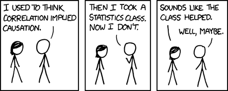
Correlation means...

Source: XKCD
        ---

## Correlation means...

<img src=http://imgs.xkcd.com/comics/correlation.png style="width: 800px">

<span class="footnote">Source: [XKCD](http://xkcd.com/552/)</span>
Spurious correlations

Source: tylervigen.com
        ---

## Spurious correlations

<img src=assets/img/spurious.png style="width: 800px">

<span class="footnote">Source: [tylervigen.com](http://www.tylervigen.com/view_correlation?id=1703)</span>
Visualization for development
Possible questions to address:
- Where are our donors coming from - and do we have people in the right places?
- Are there relationships between donor characteristics/activities and donor volume?
- What relationships/networks exist between donors?
        ---

## Visualization for development

Possible questions to address:
* Where are our donors coming from - and do we have people in the right places?
* Are there relationships between donor characteristics/activities and donor volume?
* What relationships/networks exist between donors?
Data visualization tools
For (many) data visualization tools, pick two of the following three:
- Free to use
- Data & visualizations stored on your own machine or server
- Gentle learning curve
However, there are many different tools available for different use cases
        ---

## Data visualization tools

For (many) data visualization tools, pick __two__ of the following three:
* Free to use
* Data & visualizations stored on your own machine or server
* Gentle learning curve

However, there are many different tools available for different use cases
Tool demonstration: Tableau

        ---

## Tool demonstration: Tableau

<img src=http://upload.wikimedia.org/wikipedia/commons/0/01/Tableau_Software_Logo_Small.png style="width: 800px">
Tool demonstration: RStudio

        ---

## Tool demonstration: RStudio

<img src=http://www.rstudio.com/wp-content/uploads/2014/07/RStudio-Logo-Blue-Gradient.png style="width: 800px">
Questions?
- Web: http://personal.tcu.edu/kylewalker
- Email: kyle.walker@tcu.edu
- Link to this presentation: http://personal.tcu.edu/kylewalker/big12dev/
        ---

## Questions?

* Web: http://personal.tcu.edu/kylewalker
* Email: kyle.walker@tcu.edu
* Link to this presentation: http://personal.tcu.edu/kylewalker/big12dev/


