Reproducing the Washington Post housing price maps with R and ggplot2
June 29, 2016
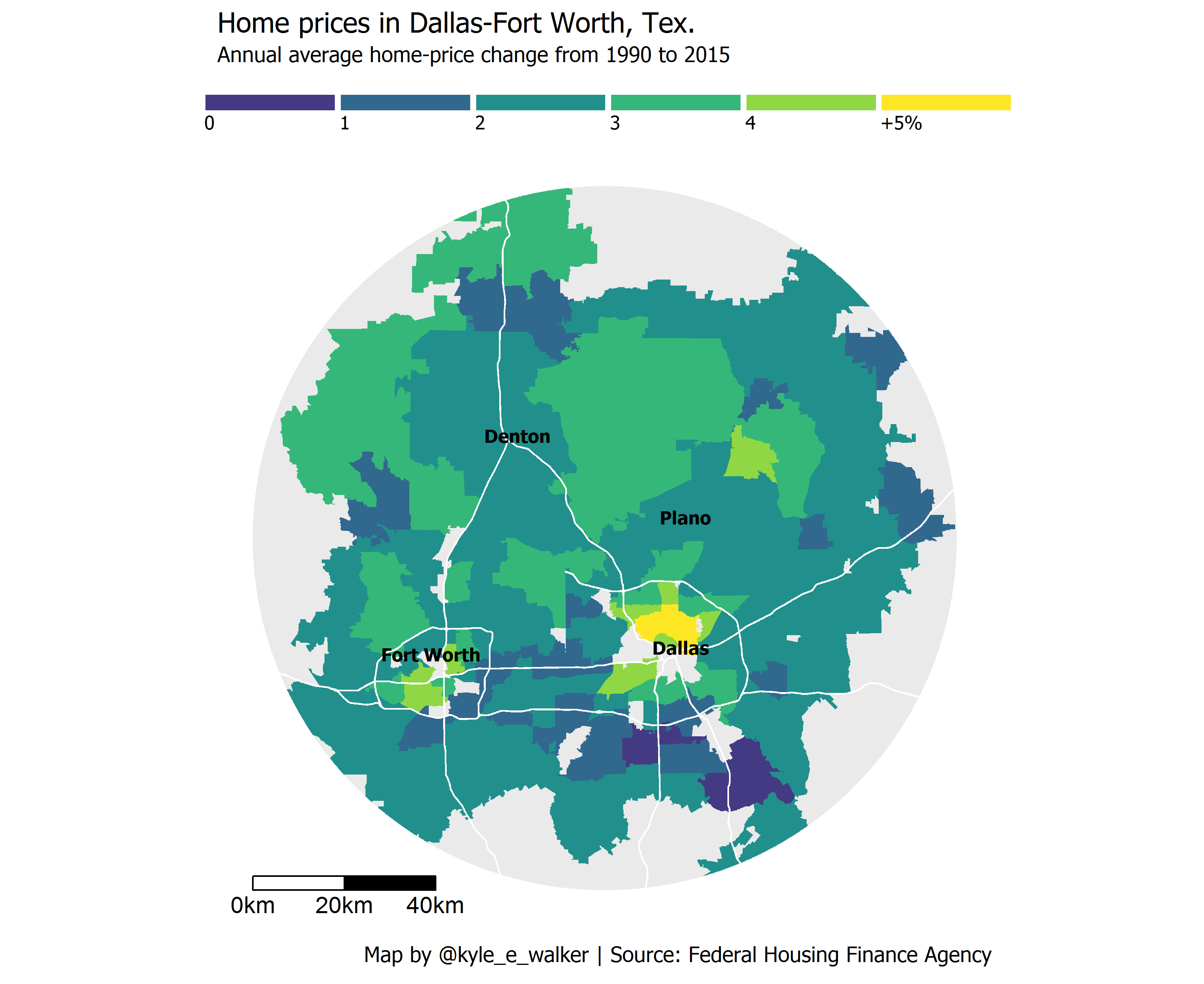
This week, Emily Badger and Darla Cameron at The Washington Post’s Wonkblog published an article (linked here) discussing data from the Federal Housing Finance Agency that suggest that the greatest increase in house prices in large metropolitan areas tend to be found in urban rather than suburban areas. Wonkblog published a series of maps illustrating this for Washington DC, Portland OR, Houston TX, Denver CO, and Minneapolis-St. Paul, MN. I was particularly impressed by the visuals produced by the Wonkblog team, but wanted to see if the trend is replicated in my metropolitan area, Dallas-Fort Worth. In turn, I set out to re-produce Wonkblog’s map for DFW as best as I could with R’s ggplot2 visualization package. Here is the result:

It appears as though the greatest annual increases in house prices in DFW are indeed found nearer to the two urban cores of Dallas and Fort Worth - although unfortunately some central-city zips are missing from the dataset (including 76102, which covers downtown Fort Worth). I’ll follow up with a more detailed analysis of the data over at TCU’s Center for Urban Studies blog. Here, I’m going to go over how I made the map - which I was able to accomplish entirely within R. You can get the full script at https://gist.github.com/walkerke/0d95f962eb8bd88b3ce83c16e785ff1d.
To get started, I obtained the data from http://www.fhfa.gov/DataTools/Downloads/Documents/HPI/HPI_AT_ZIP5.xlsx and saved the Excel spreadsheet in my working directory. In my R script, I loaded up a bunch of packages to be used in this process, then used dplyr to process the data, finding the average annual percent change in housing prices for each zip code in the dataset. There was a little wrangling to be done - for one, missing values in the spreadsheet were denoted with a period, which caused the annual change column to be interpreted as a string. Also note how I created a factor attribute to match the classification scheme used in Wonkblog’s maps; we’ll come back to this later.
library(readxl)
library(tigris)
library(sp)
library(maptools)
library(ggplot2)
library(rgdal)
library(ggthemes)
library(viridis)
library(extrafont)
library(rgeos)
library(raster)
library(dplyr)
library(ggsn)

# Process tabular data as in WaPo article
orig <- read_excel('HPI_AT_ZIP5.xlsx', skip = 6)

averages <- orig %>%
  select(zip = `Five-Digit ZIP Code`, year = Year, change = `Annual Change (%)`) %>%
  filter(year > 1989, change != '.') %>%
  mutate(change = as.numeric(change)) %>%
  group_by(zip) %>%
  summarize(avg = mean(change, na.rm = TRUE)) %>%
  mutate(avgf = cut(avg, breaks = c(-100, 0:5, 100), right = FALSE,
                    labels = c('Decrease', '0', '1', '2', '3', '4', '+5%')))
I then needed to figure out what zip codes are in the Dallas-Fort Worth area. Zip codes are curious geographies in that they aren’t actually areal units in the way that we normally think about them; they are merely codes that the US Postal Service uses to guide mail routes. Some zip codes are no more than specific buildings, or even PO boxes. Nonetheless, zip codes are a very common “geography” at which data are aggregated, such as in this dataset. In response to this demand for zip code geographies, the US Census Bureau produces “zip code tabulation areas,” also known as ZCTAs, which approximate the areal extent of zip codes. As you might guess, ZCTAs don’t always fit neatly within city or county (or even state, in some instances) boundaries.
In R, your one-stop shop for Census geographic data is the tigris package. I wrote this package with Bob Rudis last year; it allows you to get most Census shapefiles and load them into R with a single line of code. I fetched ZCTA data for the map; county data to figure out which ZCTAs intersected the four largest DFW counties, which is determined with the over function from the sp package; primary roads data for a visual reference; and places data to label major cities. Finally, I subsetted the averages data frame for those ZCTAs that intersected the four counties.
zips <- zctas(cb = TRUE)

ctys <- counties('TX', cb = TRUE)

dfw_metro <- ctys[ctys$NAME %in% c('Dallas', 'Tarrant', 'Collin', 'Denton'), ]

over_zips <- bind_rows(over(dfw_metro, zips, returnList = TRUE))

dfw_zips <- spTransform(zips[zips$ZCTA5CE10 %in% over_zips$ZCTA5CE10, ],
                        CRS("+init=epsg:26914"))

pri <- spTransform(primary_roads(), CRS("+init=epsg:26914"))

cities <- places('TX', cb = TRUE)

dfw_cities <- spTransform(cities[cities$NAME %in% c('Fort Worth', 'Dallas', 'Denton', 'Plano'), ],
                          CRS("+init=epsg:26914"))

dfw_cities$long <- coordinates(dfw_cities)[,1]

dfw_cities$lat <- coordinates(dfw_cities)[,2]

dfw_averages <- averages[averages$zip %in% dfw_zips$ZCTA5CE10, ]
With the data in hand, I had to figure out how to replicate the visualization. The Wonkblog maps have a compelling look in which ZCTAs around the major cities are in front of a circular grey background, and fringe ZCTAs are cut off at the edge of the circle. To accomplish this, I turned to R’s spatial analysis infrastructure, which is largely found in the rgeos package. The steps are as follows:
- I created a circular
SpatialPolygonsobject withgBuffer, with a radius that is half of the east-west extent of the zips’ bounding box. This will cover most of the zips, but cut off the edges as in the Wonkblog maps.
- I then “clipped” the ZCTAs to the extent of the circle to achieve the Wonkblog look with
gIntersection.
- I use the
gClipfunction authored by Robin Lovelace to clip the primary roads data, which is much faster than a simplegIntersectioncall as the primary roads data cover the entire US by default.
# Create a circle
radius <- ( (bbox(dfw_zips)[3] - bbox(dfw_zips)[1]) / 2 )

circle <- gBuffer(gCentroid(dfw_zips), width = radius, quadsegs = 500)

# Restrict the zips to the extent of the circle
dfw_clipped <- gIntersection(dfw_zips, circle, byid = TRUE, id = dfw_zips$ZCTA5CE10)

dfw_clipped$id <- row.names(dfw_clipped)

# Clip function for the roads thanks to Robin Lovelace (faster)
gClip <- function(shp, bb){
  if(class(bb) == "matrix") b_poly <- as(extent(as.vector(t(bb))), "SpatialPolygons")
  else b_poly <- as(extent(bb), "SpatialPolygons")
  proj4string(b_poly) <- proj4string(shp)
  gIntersection(shp, b_poly, byid = T)
}

pri_clipped <- gClip(pri, circle)

# Convert to SpatialLinesDataFrame for ggplot2
pri_clipped$id <- 1:length(pri_clipped)
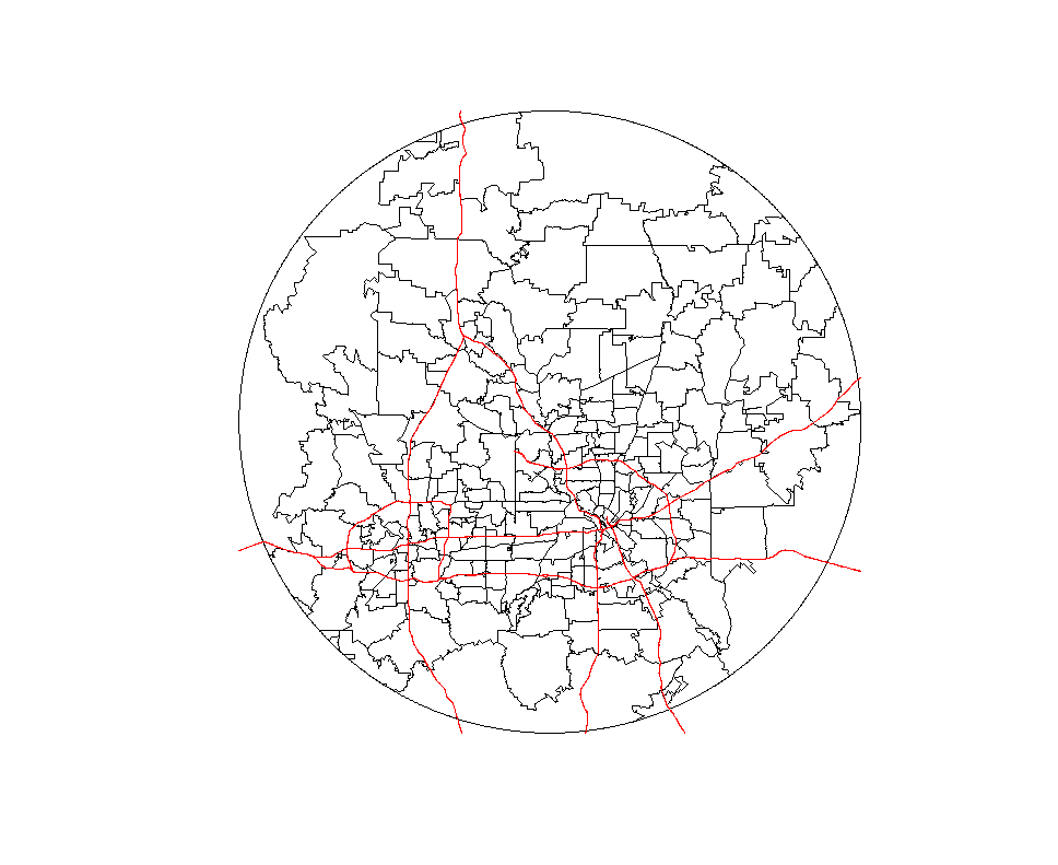
We can quickly check to see what the spatial data now look like:
plot(circle)
plot(dfw_clipped, add = TRUE)
plot(pri_clipped, add = TRUE, col = 'red')
The roads extend slightly beyond the circle, but this is OK as they will be colored white and blend in with the plot background in the final visualization.
Next, I used the code below to make the map. Some notes about the code:
- I used
fortifyto convert mySpatialobjects to data frames that ggplot2 can understand.
- I added the circle with
geom_polygonand set it with a grey background.
- The ZCTAs are visualized with
geom_map, using data from thedfw_averagesdata frame and linked by zip code ID. I use theavgffactor attribute for the polygon fill to match the Wonkblog maps. I style with the viridis palette, which is fairly similar to the palette used by Wonkblog.
- The roads are added with
geom_path.
- I also added the four reference cities - Dallas, Fort Worth, Denton, and Plano - with
geom_textto place their names at the locations of their polygon centroids.
- I use the ggsn package to add a scale bar to the map.
dfwf <- fortify(dfw_clipped, region = 'id')

circlef <- fortify(circle)

roadsf <- fortify(pri_clipped)

ggplot() +
  geom_polygon(data = circlef, aes(x = long, y = lat, group = group),
               fill = '#eaeaea') +
  geom_map(data = dfw_averages, map = dfwf,
           aes(fill = avgf, map_id = zip)) +
  geom_path(data = roadsf, aes(x = long, y = lat, group = group), color = 'white',
            size = 0.5) +
  geom_text(data = dfw_cities@data, aes(x = long, y = lat, label = NAME),
            color = 'black', fontface = 'bold', family = 'Tahoma') +
  theme_map(base_family = 'Tahoma', base_size = 14) +
  coord_equal() +
  theme(legend.position = 'top',
        legend.key = element_blank()) +
  scale_fill_manual(values = viridis(7)[2:7],
                    guide = guide_legend(nrow = 1, direction = 'horizontal',
                                         label.hjust = 0, label.position = 'bottom',
                                         keywidth = 5.51, keyheight = 0.75, title = "")) +
  labs(title = "Home prices in Dallas-Fort Worth, Tex.",
       subtitle = "Annual average home-price change from 1990 to 2015",
       caption = "Map by @kyle_e_walker | Source: Federal Housing Finance Agency") +
  scalebar(data = circlef, dist = 20, location = "bottomleft")
My end result resembles the Wonkblog maps for Dallas-Fort Worth, with a few exceptions. I wasn’t able to replicate the city label halo adequately, and I opted against the highway shields; these are probably best accomplished in an external graphics program.
In my opinion, the big take-away from this is that the entire process of data wrangling and visualization took place in an R script, without turning to external GIS software or graphics programs. In turn, this workflow is reproducible - go ahead and try it out for your city!